The Corpus Christi Regional Transportation Authority (CCRTA) sought a refreshed brand identity that would better reflect its commitment to modern, accessible, and community-focused transportation. The previous branding felt outdated and didn’t fully align with the organization’s evolving values, services, and rider expectations. The goal was to develop a cohesive visual system that would appeal to a broader audience while maintaining approachability and trust.
Solution
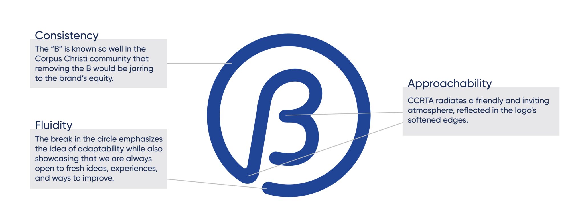
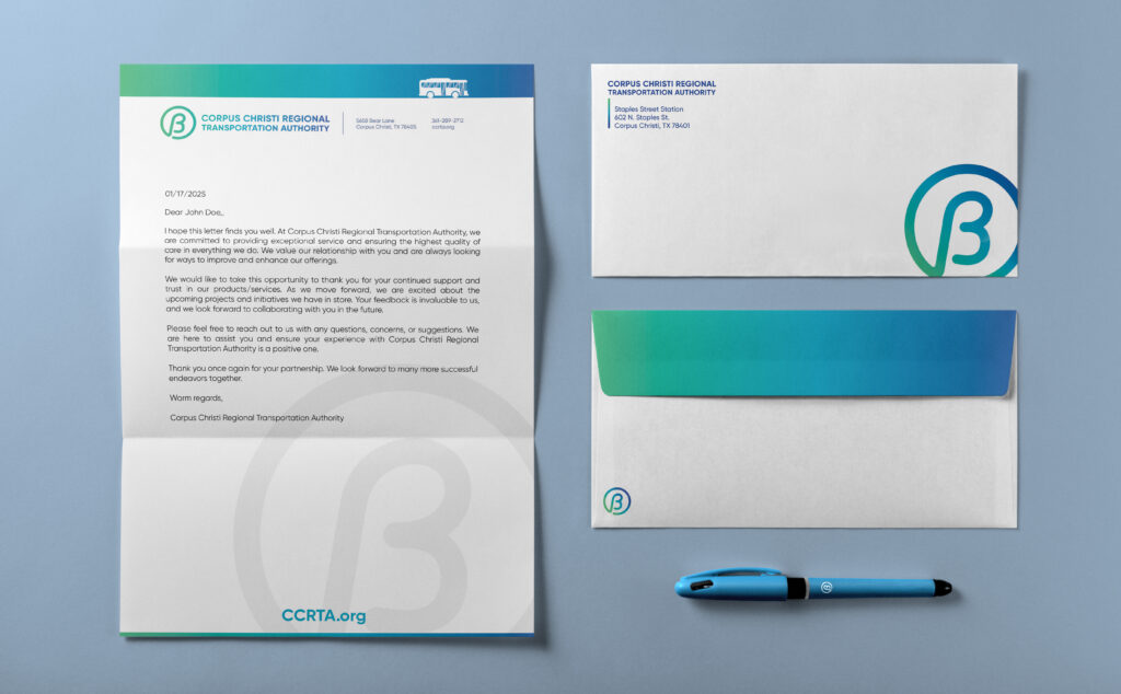
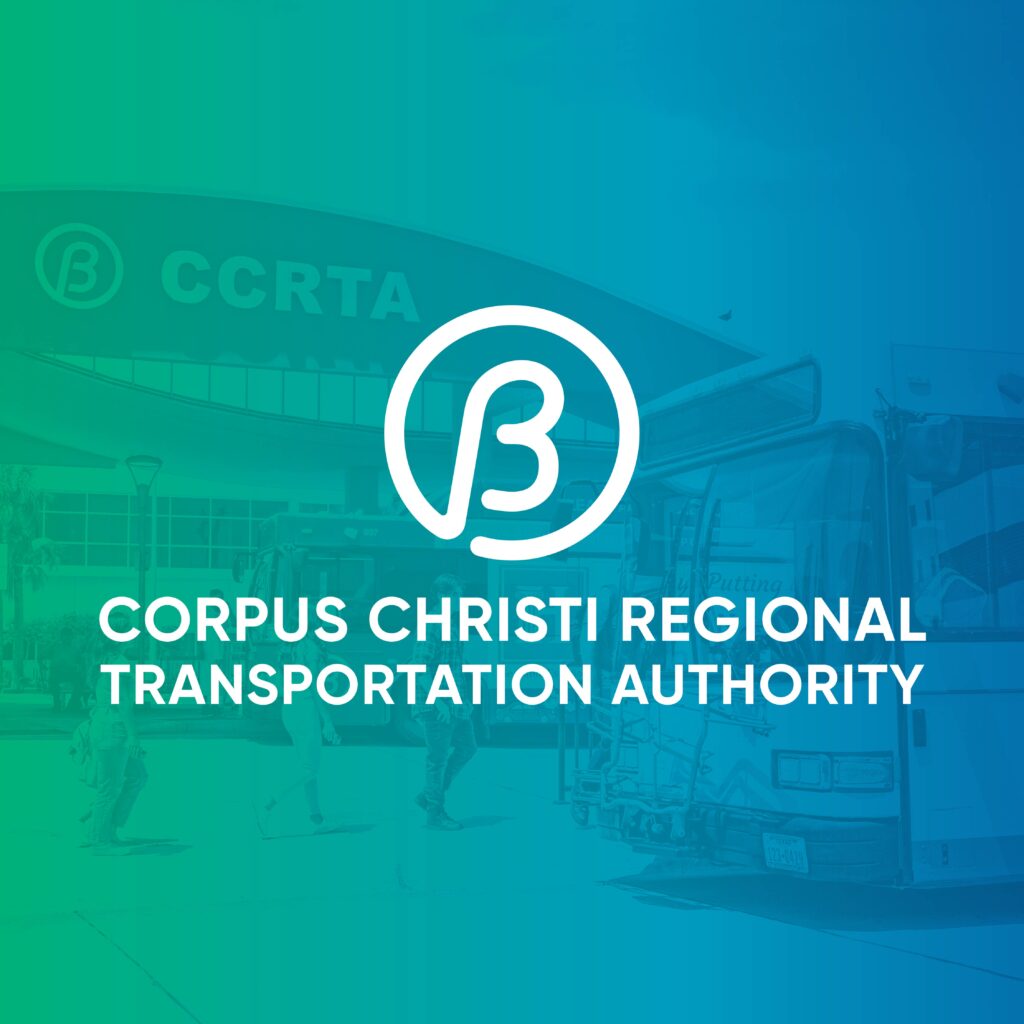
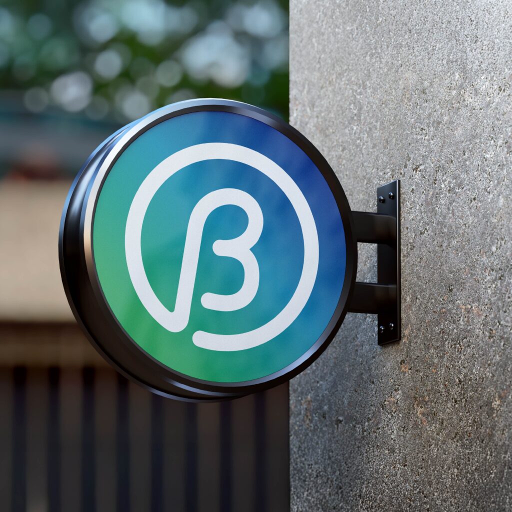
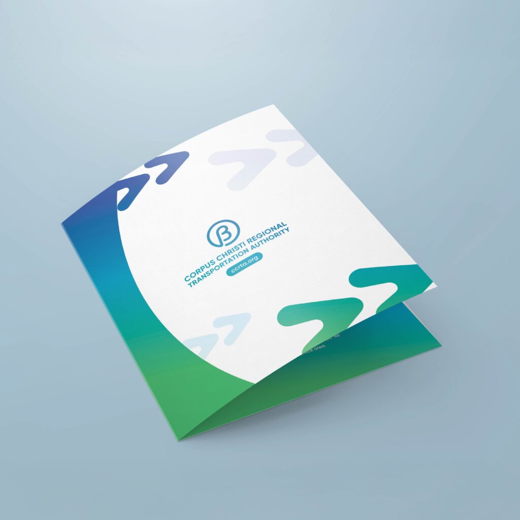
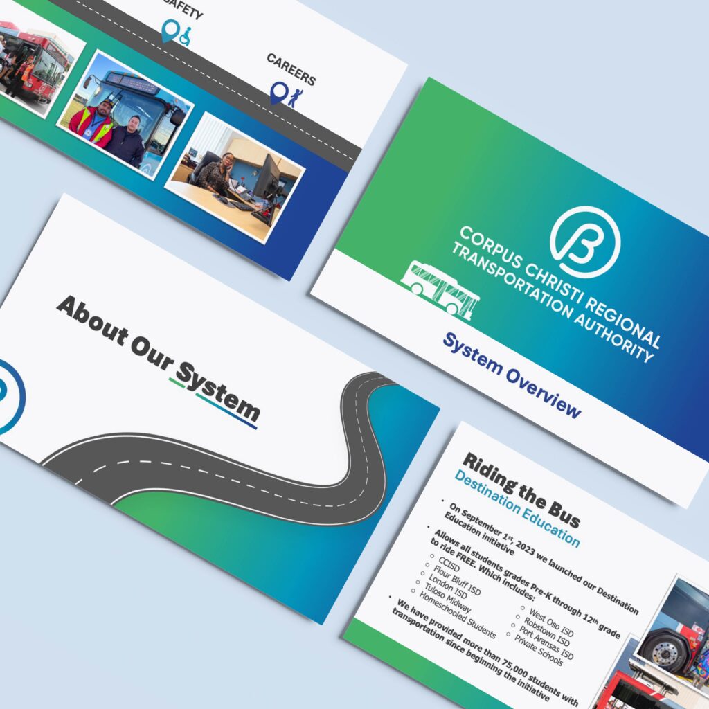
I refreshed the visual identity by introducing a modern gradient with the updated color palette, reflecting the vibrant, coastal spirit of the Corpus Christi community. The gradient adds depth and energy to the brand, while the updated logo, typography, and marketing materials ensure a cohesive and contemporary look across all platforms. This rebrand enhances CCRTA’s accessibility and connection to the community while offering a flexible, modern visual system.
Modernizing the Brand
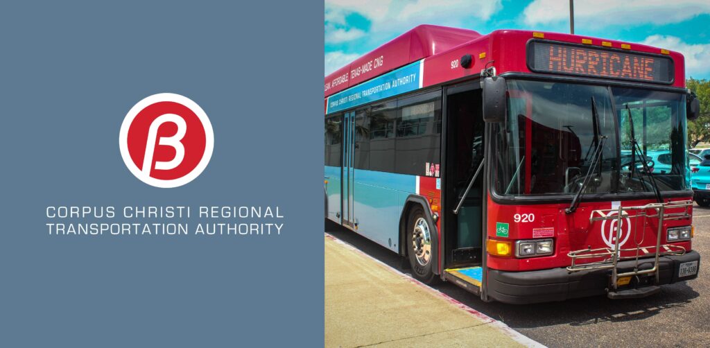
The previous brand felt dull and uninviting, often fading into the background instead of standing out. Its color palette was especially problematic—easily washed out on sun-exposed surfaces like buses and signage—leading to an inconsistent and weakened visual presence. A brighter, more durable identity was clearly needed.